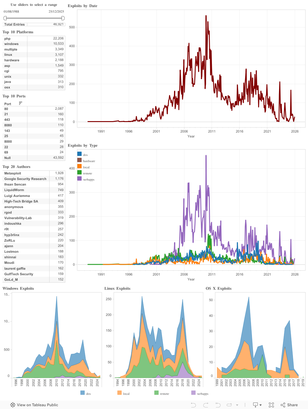
Exploit Database Statistics
The following graphs and statistics provide you with a glimpse of the entries that have been added to the Exploit Database over the years. They will be re-generated, at minimum, on a monthly basis and will help you visualize how the exploit landscape is changing over time.
These are not merely static graphs and tables so you can interact with the data in multiple ways. By using the sliders at the top, you can narrow down your view to a particular range of dates or you can select any of the items in the tables below to filter the data based on platform, port, or author. The various charts can also be interacted with to zoom in or out, select particular points, or draw a custom selection.
To change the view back to the default, you will find a ‘Reset’ button at the bottom left or you can choose to ‘Undo’ and ‘Redo’ your selections.